Height-for-width layout with CATextLayer (part 2)
October 27, 2009
Last week I wrote about my experiments to get a height-for-width layout working with a Core Animation text layer. In other words, a layer that resizes vertically to fit its text within a certain width. So far we have the text measuring right and now it's time to put it to use.
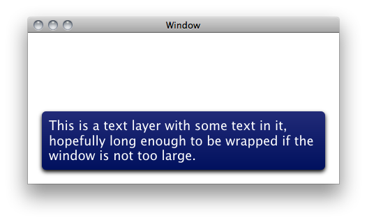
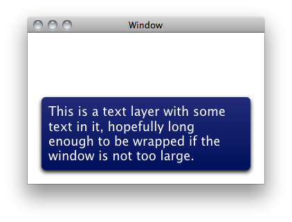
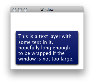
Let's start with an illustration to show what the end goal is:


The text is automatically wrapped to fit the available size, which by itself is nothing new, as long as you manually provide the width and height, but in this case the size needs to be calculated from the height.
Layout managers
The way Core Animation handles laying out layers is through the layout manager protocol:
- (CGSize)preferredSizeOfLayer:(CALayer *)layer;
- (void)layoutSublayersOfLayer:(CALayer *)layer;
- (void)invalidateLayoutOfLayer:(CALayer *)layer;
In this post I will focus on the two former, preferredSizeOfLayer: and layoutSublayersOfLayer:. The latter is useful when you are caching results and need to invalidate them, but we ignore that for now.
Constraints
The layout manager implementation shipped with Core Animation is called CAConstraintLayoutManager, and works by letting you apply constraints on certain properties of the layer's geometry. Those are min/mid/max for x/y, width and height. You can also scale and offset the resulting values by constant values which gives a very high level of freedom to set up simple or complex relationships between different layers. In our example, as seen on the images above, we have three layers: the white background, the blue frame, and the text. As I want the blue frame to be resized to fit the text, the easiest setup was to add both the blue frame and the text layer as direct sublayers of the white background. The constraints then become:
- Resize the text layer's width to follow the width of the background (with some margin)
- Center the text layer horizontally within the background
- Adjust the text layer's bottom at the bottom of the background (with some margin)
- Make the blue frame follow the size of the text layer (with padding)
- Center the blue frame relative to the text layer
With the standard layout manager, this results in the text layer being one line and the text to be truncated at the right edge. This is because the text layer reports its preferred frame size to have the height of one line of text.
The height-for-width layout manager
Enter our custom layout manager. Since we still want to be able to use constraints, we subclass the constraints layout manager. By overriding its method preferredSizeOfLayer: and have it assign the size we calculated in the previous post to the text layer, we can get the behavior we want (but with one caveat, more about that soon):
- (CGSize)preferredSizeOfLayer:(CALayer *)layer
{
    if ([layer isKindOfClass:[CATextLayer class]] && ((CATextLayer *)layer).wrapped) {
        CGRect bounds = layer.bounds;
        bounds.size = [self frameSizeForTextLayer:(CATextLayer *)layer];
        layer.bounds = bounds;
    }

    return [super preferredSizeOfLayer:layer];
}
The caveat is that the layout manager goes through the layers to resize and place them, including setting the width of the text. Setting the width of the text could change its height, and some constraints might need to be redone after doing that!
This means we also have to override layoutSublayersOfLayer: to add a small hack. We first invoke super's implementation to handle the normal constraints based layout. Then we setup the new heights for any text layers as a result of the first pass. Finally we invoke super's implementation again. As long as you don't have constraints that would change the text width in the second pass, this works nicely.
- (void)layoutSublayersOfLayer:(CALayer *)layer
{
    // First let the regular constraints kick in to set the width of text layers.
    [super layoutSublayersOfLayer:layer];

    // Now adjust the height of any wrapped text layers, as their widths are known.
    for (CALayer *child in [layer sublayers]) {
        if ([child isKindOfClass:[CATextLayer class]]) {
            [self preferredSizeOfLayer:child];
        }
    }

    // Then let the regular constraints adjust any values that depend on heights.
    [super layoutSublayersOfLayer:layer];
}
This is obviously stretching the intention of the constraint layout manager, but it works for simple and common layer trees like the one described here. There are also some easy opportunities for optimizing the code, as I tried to keep it as simple as possible (such as caching the text measuring, and not laying out unless necessary).
I hope the posts and code will prove useful for someone else besides me. And as usual, if anyone knows a better way to do this, please let me know.
The code is available as an Xcode project in a git repo or source package.